← Back to work
Rocket E-com
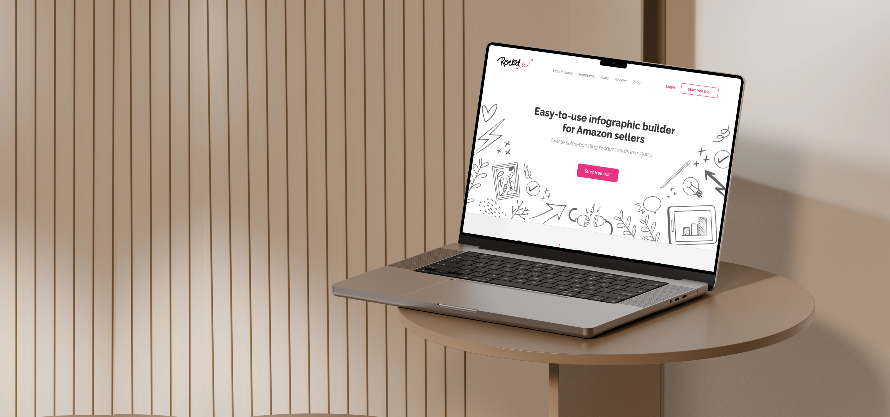
Creating a new marketplace seller tool that transforms infographic creation into an intuitive, sales-boosting design experience
Creating a new marketplace seller tool that transforms infographic creation into an intuitive, sales-boosting design experience
Marketplace sellers rely on high-quality product visuals to attract customers and compete in crowded marketplaces. Yet most small businesses don't have design expertise or the budget to hire professionals.
Design an intuitive product that enables marketplace sellers to create professional product graphics without prior design experience.
Owned the product design process from concept exploration to launch, collaborating closely with stakeholders to define the product direction.
This project followed a fast, stakeholder-driven design process. After receiving the initial brief, I explored several visual directions, aligned with the team on the final concept, and translated it into a responsive product and marketing experience.
Rocket needed to feel more credible, polished, and conversion-focused. The goal was to create a visual experience that could build trust quickly, communicate the product’s value clearly, and make the tool feel approachable for marketplace sellers without design experience.
Create a polished, professional first impression that makes Rocket feel credible and reliable.
Show how stronger product visuals can help sellers attract attention, stand out, and drive more sales.
Make the tool feel easy and approachable, reducing hesitation and inspiring users to take the first step.
Before moving into high-fidelity design, I mapped the homepage content architecture and translated it into a long-form, conversion-focused wireframe. Each section was structured to support the seller’s decision-making flow — from understanding the product and seeing template examples to recognizing business value, building trust, and taking the next step.
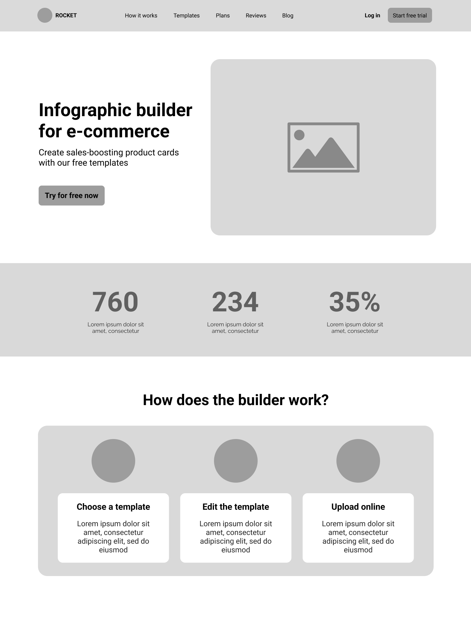
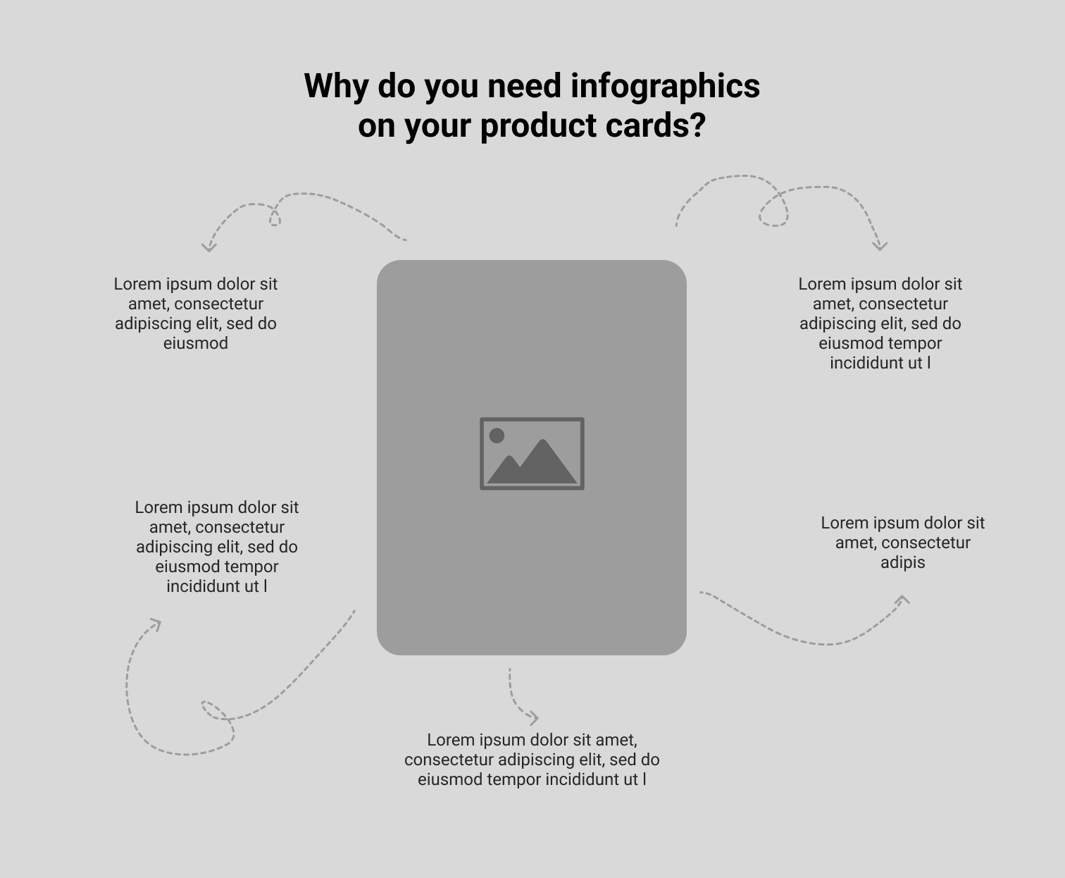
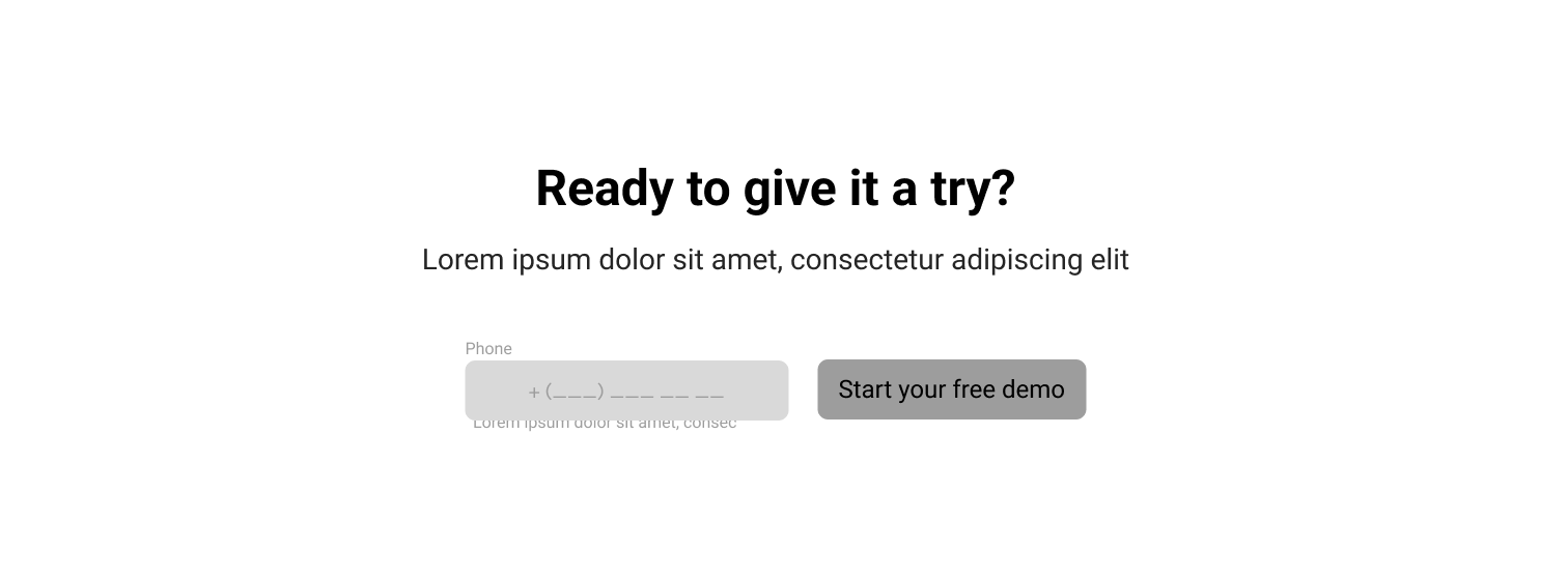
After the wireframe was approved, the next challenge was defining how bold, playful, or minimal Rocket should feel. I explored several visual directions to help stakeholders align on the product’s personality before moving into high-fidelity design.
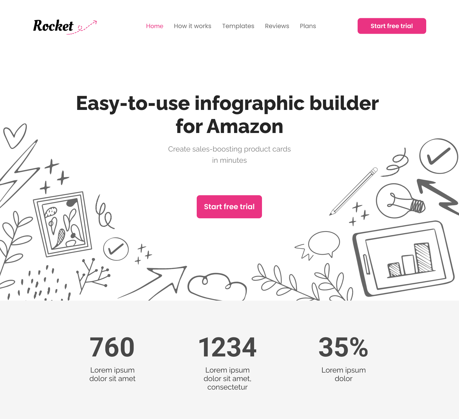
Playful, human, and creative. Uses doodles and organic shapes to make Rocket feel approachable and easy to try.
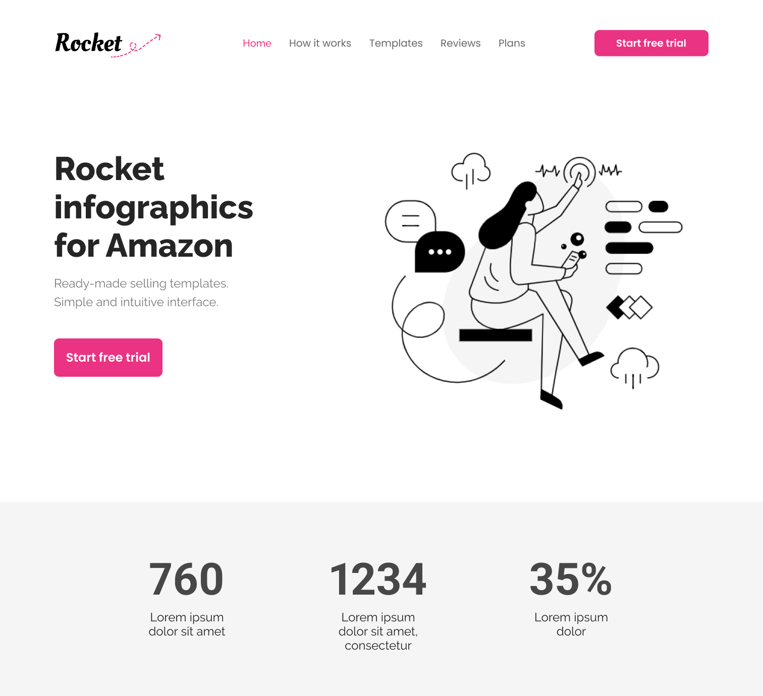
Clean, simple, and credible. Uses a familiar SaaS layout to make the product feel trustworthy and easy to understand.
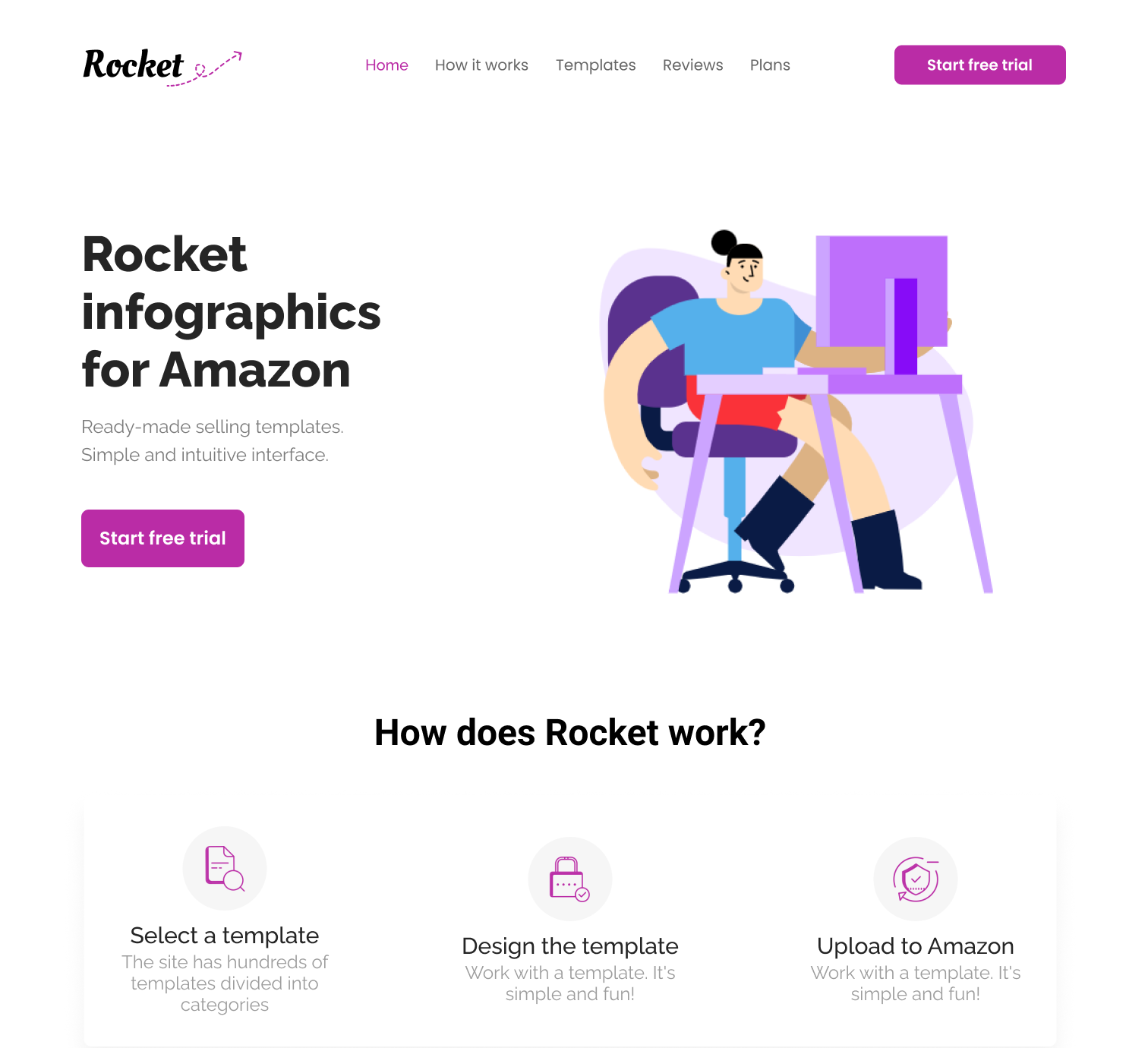
Another variation of the professional direction, adding colorful character illustration to make the product feel warmer and more approachable.
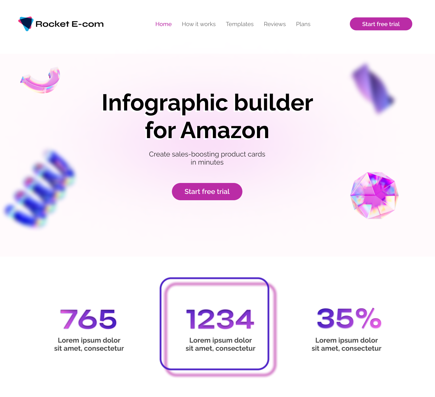
Bright, energetic, and attention-grabbing. Uses gradients and bold visual contrast to create a more modern product feel.
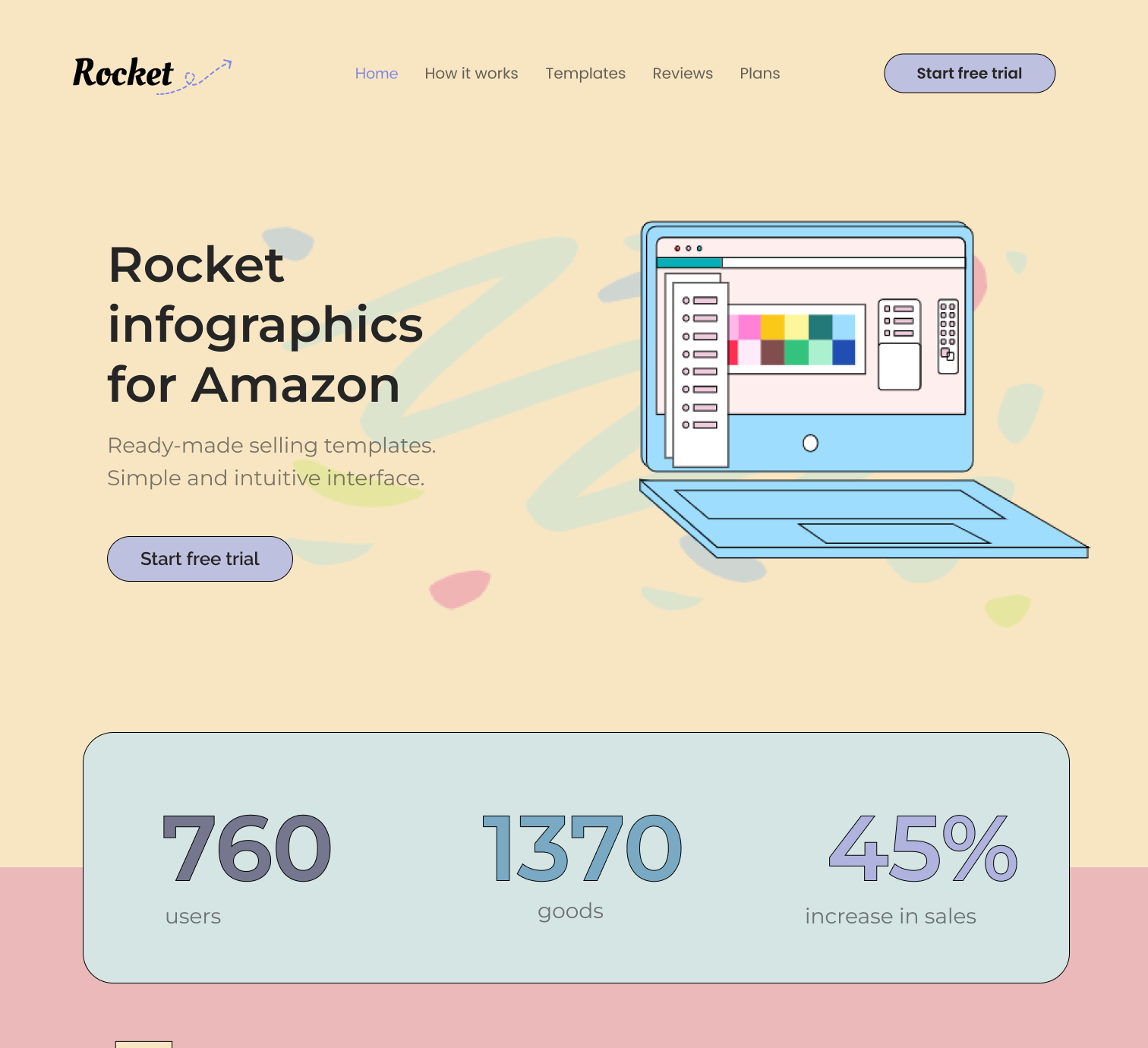
A 90s-inspired direction with a nostalgic, back-to-school feel. Designed to grab attention, evoke emotion, and make Rocket stand out from typical SaaS tools.
I recommended the hand-drawn direction because it made the product feel more approachable, reduced the perceived complexity of trying a new tool, and supported the goal of building trust through a friendly, polished experience.
After reviewing the directions internally and gathering lightweight feedback from several test customers, the team selected the hand-drawn direction. In addition to the reasons given above, it also gave the brand a more distinctive personality, which made the homepage feel more memorable.
After the hand-drawn direction was selected, I translated it into a visual foundation for the final UI. The goal was to make Rocket feel polished and credible, while still keeping the product human, creative, and easy to approach.
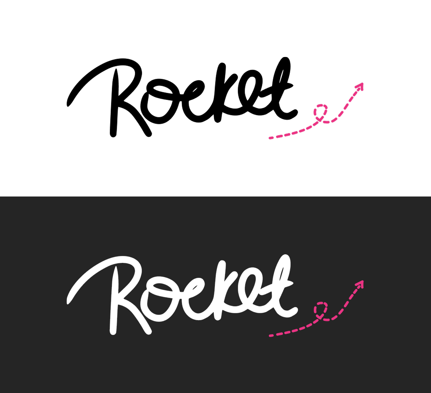
A custom sketched wordmark that gave the brand a more personal and creative feel.

Sketch-like elements that make the interface feel creative, low-pressure, and easier to explore.
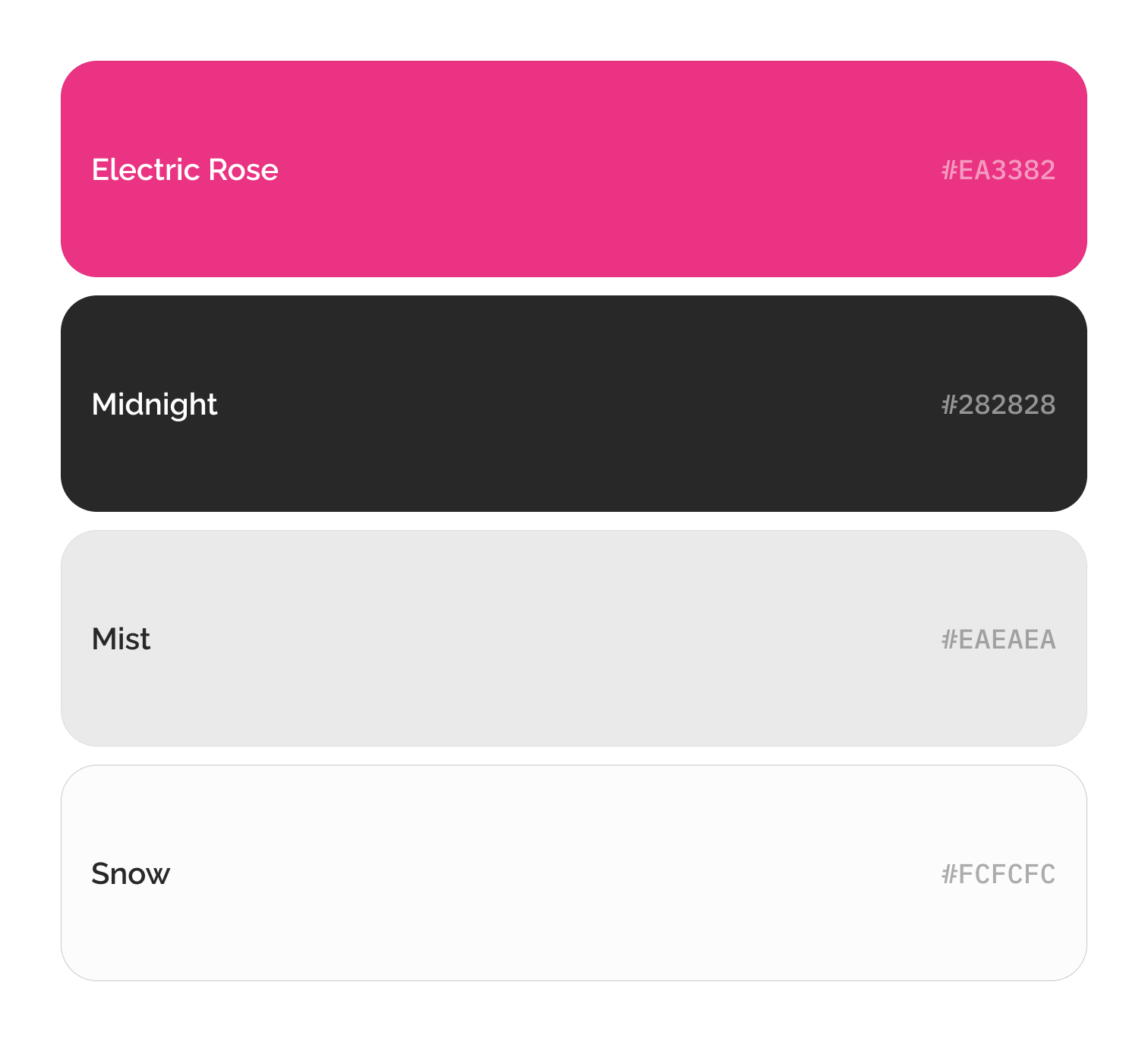
Bold pink direction that helped Rocket feel energetic and memorable
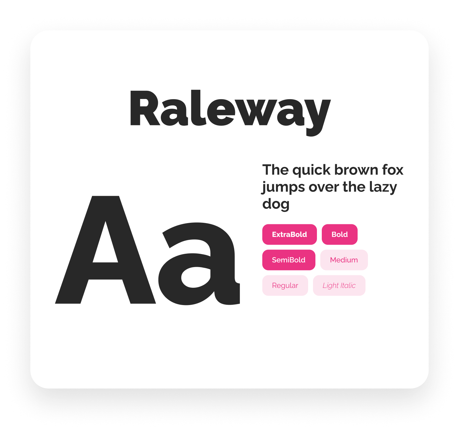
Friendly, modern typefaces that feel contemporary but not corporate
The final homepage translated the selected direction into a polished, conversion-focused experience across desktop and mobile. Each section was designed to move sellers through a clear decision-making flow — from understanding Rocket’s value to building confidence in the product.
Value proposition, brand personality, and primary CTA adapted across desktop and mobile.
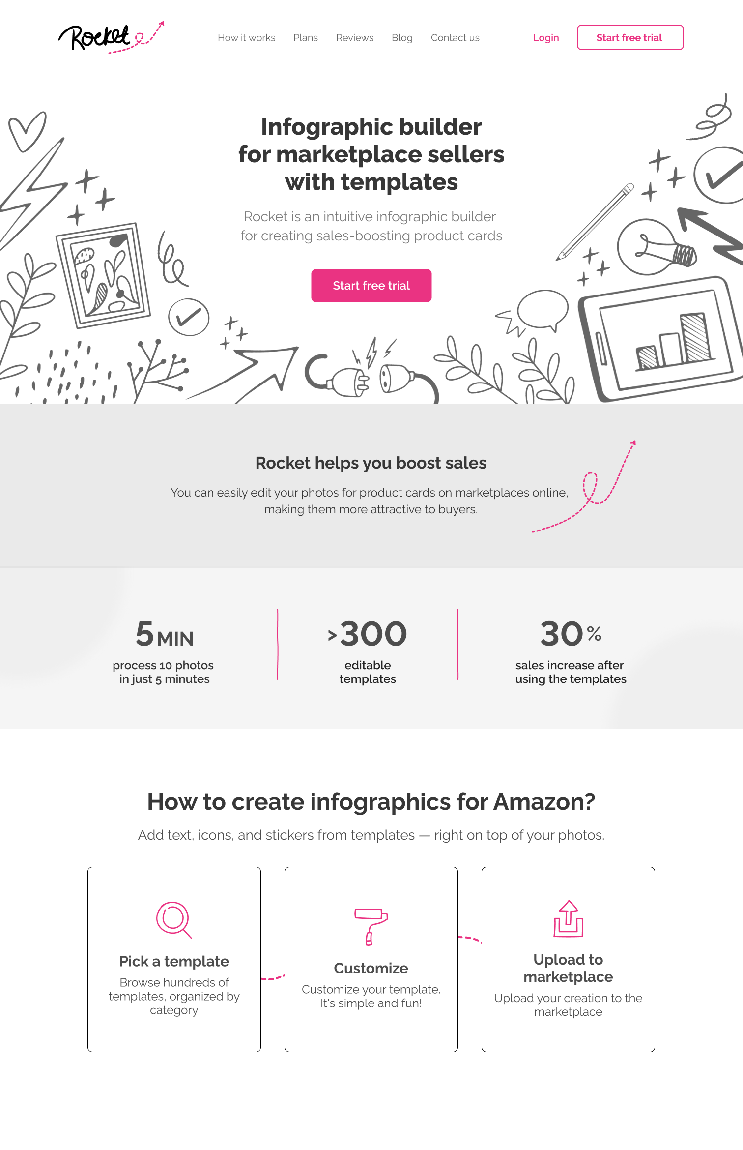
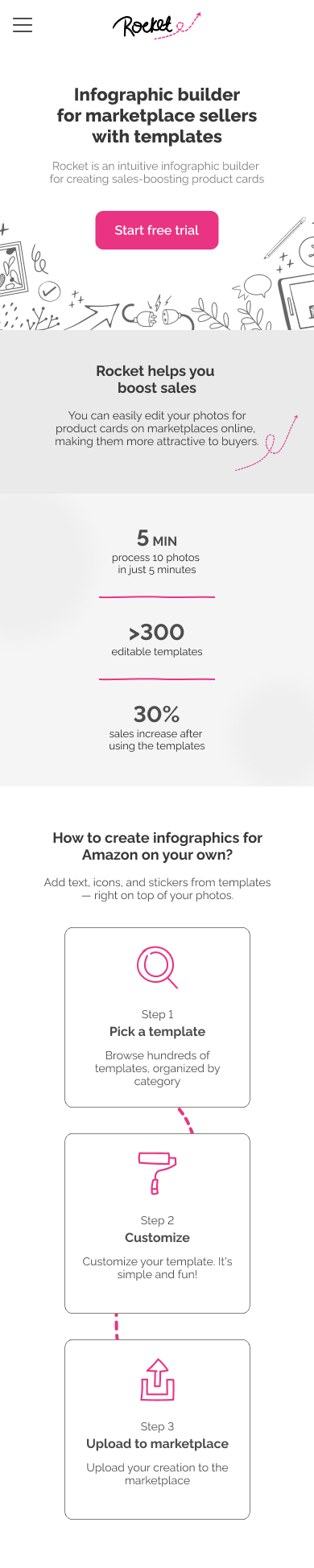
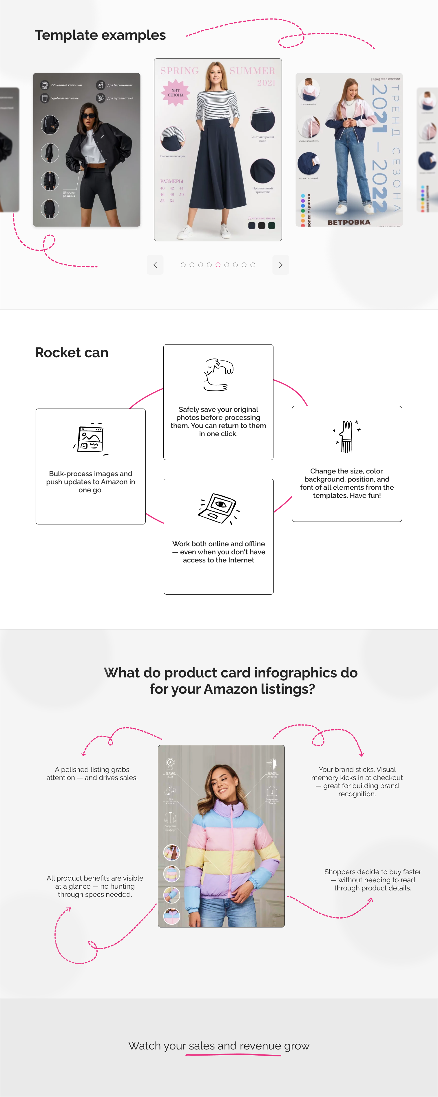
Core product features and capabilities translated into a simple responsive flow.

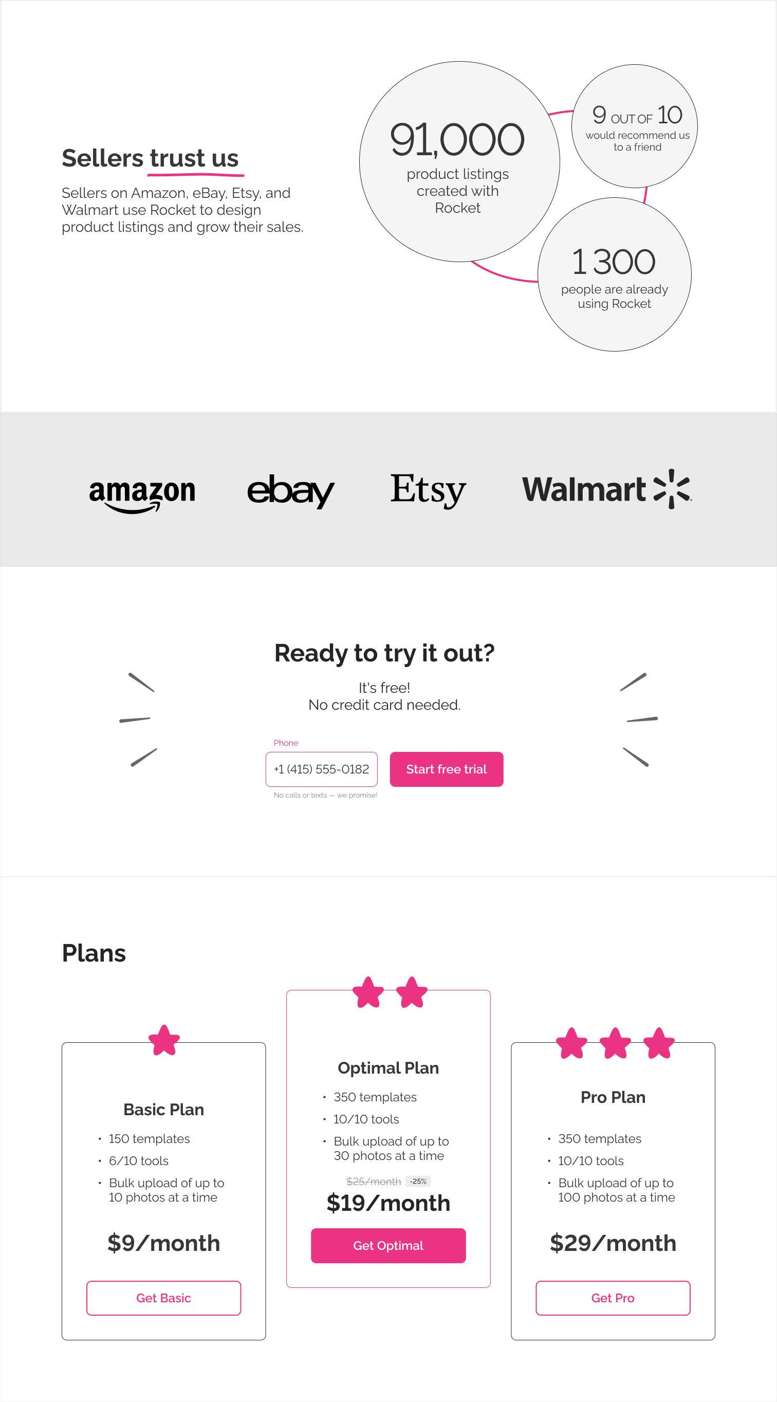
Business proof, marketplace credibility, and pricing moments designed to reduce hesitation and support conversion.

Reviews, success stories, FAQ, and educational content designed to answer questions, build credibility, and support organic discovery through helpful resources for marketplace sellers.
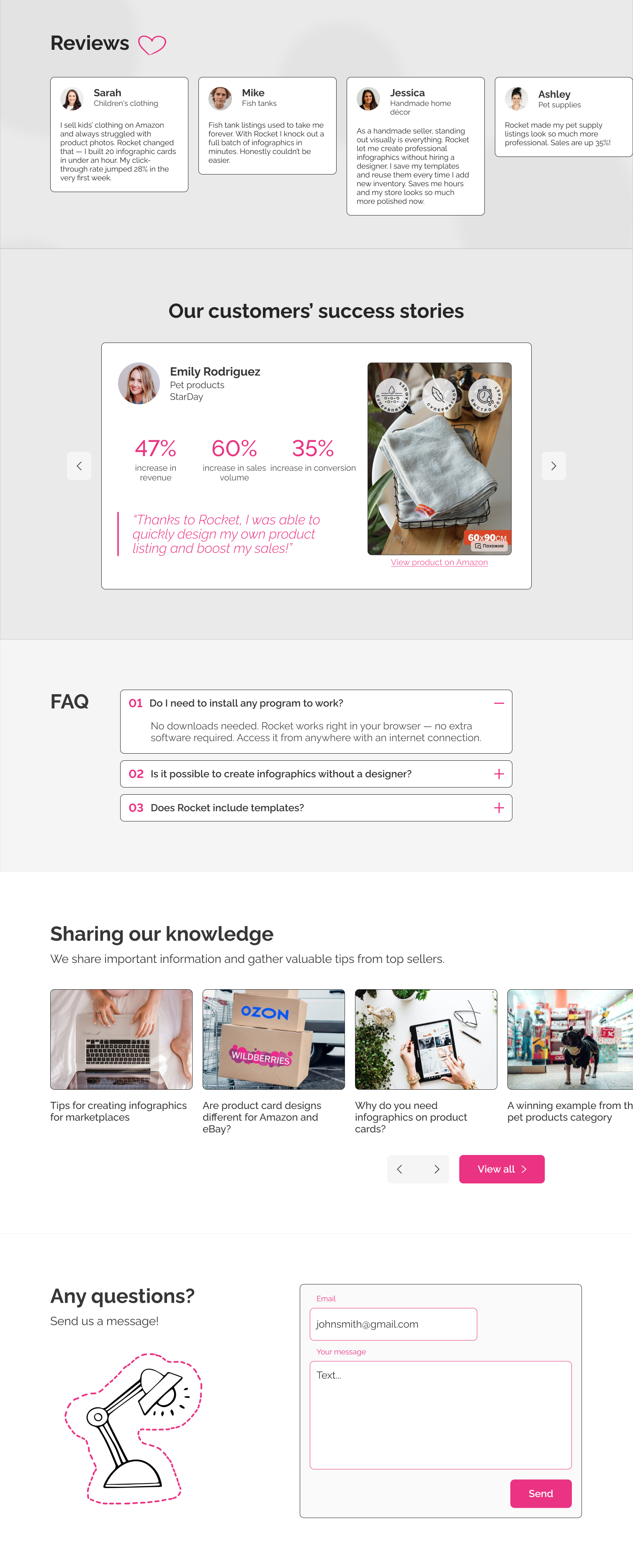

As the solo designer, I delivered final high-fidelity mockups that were later shipped by the development team. I worked closely with the product manager and product owner, who coordinated feedback from other stakeholders.
The final design combined visual language, content structure, product explanation, calls to action, and educational support content to reshape Rocket’s brand perception — from a functional tool into a more credible business partner for marketplace sellers. It supported the main business goal of improving conversion without compromising the user experience.