← Back to work
Cinemax
Redesigning how film lovers discover, track, and buy tickets — without the friction.
Redesigning how film lovers discover, track, and buy tickets — without the friction.
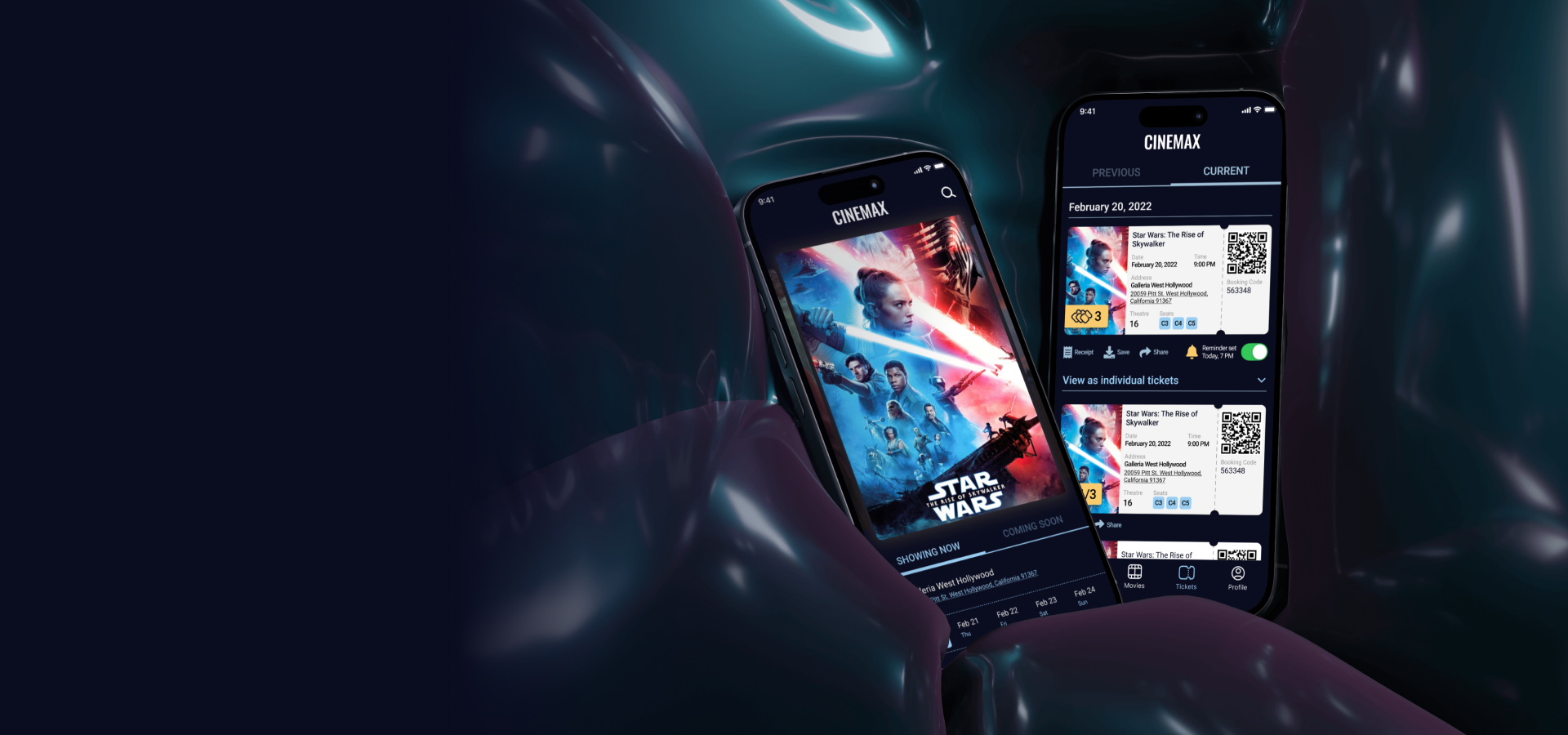
Cinemax App is a concept project of a cinema app created as part of the Google UX Design Specialization course. It intends to help people pick a movie and buy tickets in the most efficient and convenient way.
UX/UI Designer — end-to-end, from user research to high-fidelity prototyping.
The process of booking movie tickets online is confusing and not convenient. Existing apps focus on the transaction, not on helping people decide what — and where — to watch.
Design an app for Cinemax — a concept cinema chain — that allows users to easily browse films and book tickets to the movies online.
The goal of this foundational research was to understand users' needs and determine how my product could address them. Two questions framed every interview:
I conducted interviews to understand the users' needs, thoughts, and experiences. The user group consisted of working adults aged 30–40 who visit the cinema at least once a month. I recorded and transcribed each interview, then synthesised the results into an affinity map in Miro.
The seat icons on mobile are too small — some users prefer web over mobile because of it.
Not all services offer Apple Pay; users abandon checkout when they have to enter card details manually.
Tickets get emailed and lost in spam, and the booking history is often impossible to find.
Unnecessary steps are required to find the right cinema or reach payment (e.g. skipping the snack menu).
Two personas captured the most common goals and pain points from the interviews. Meet Olivia, a working single mother of two, and Dan, a software engineer.

As a working single mother of two, I want to quickly and easily book cinema tickets in a mobile app in advance, so that I can spend more time on what's important.
I wish there was a more seamless way to purchase tickets with my mobile. It's usually a torture, as the seats are so small.

As a big movie fan, I want to be notified about my most anticipated premieres, so that I never miss a movie run again.
Overall I don’t have any issues purchasing tickets online, but I really don’t like entering my credit card details manually.
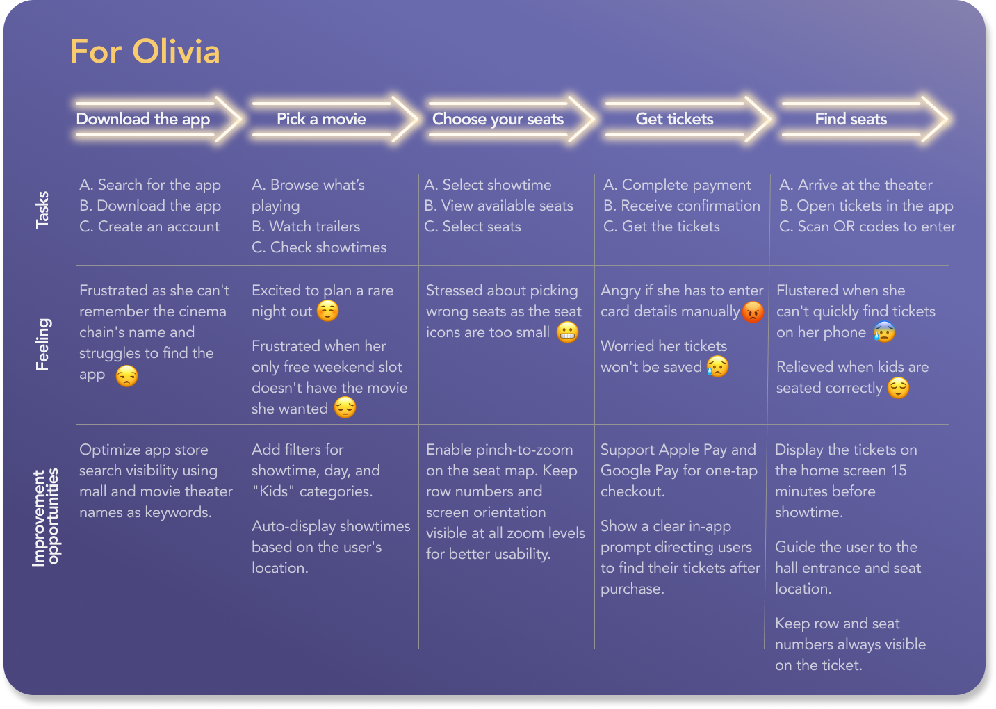
Mapping Olivia's user journey revealed some improvement opportunities at each step.
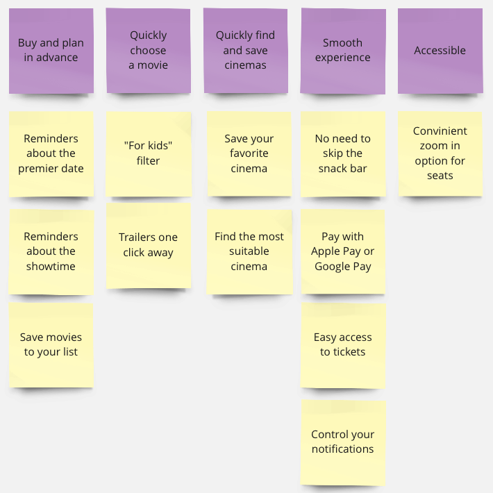
Now that I understood the users, I defined the product's value proposition by answering two questions: what does the product do, and why should the user care? I grouped the features under the core things users actually want — planning ahead, picking a movie quickly, finding a cinema, a smooth checkout, and accessibility — and tied each one back to a pain point from the interviews. That way every feature earns its place by solving a real problem.
Along the way I also wrote if/then hypothesis statements and ran a competitive audit of five cinema and ticketing services, which pointed to accessibility and seat-picking as the biggest gaps to beat.
With the problem framed, I ran a few rounds of rapid ideation. I turned the biggest pain points into How Might We questions, used Crazy Eights to push past my first and most obvious ideas, and sketched storyboards to see how Olivia and Dan would actually move through the experience. I built two types of storyboard: a big-picture one focused on the user’s needs and context, and a close-up one concentrating on the product itself and how it works.
.png)
.png)
Taking time to draft iterations for each screen on paper allowed me to explore the elements’ positioning.
.png)
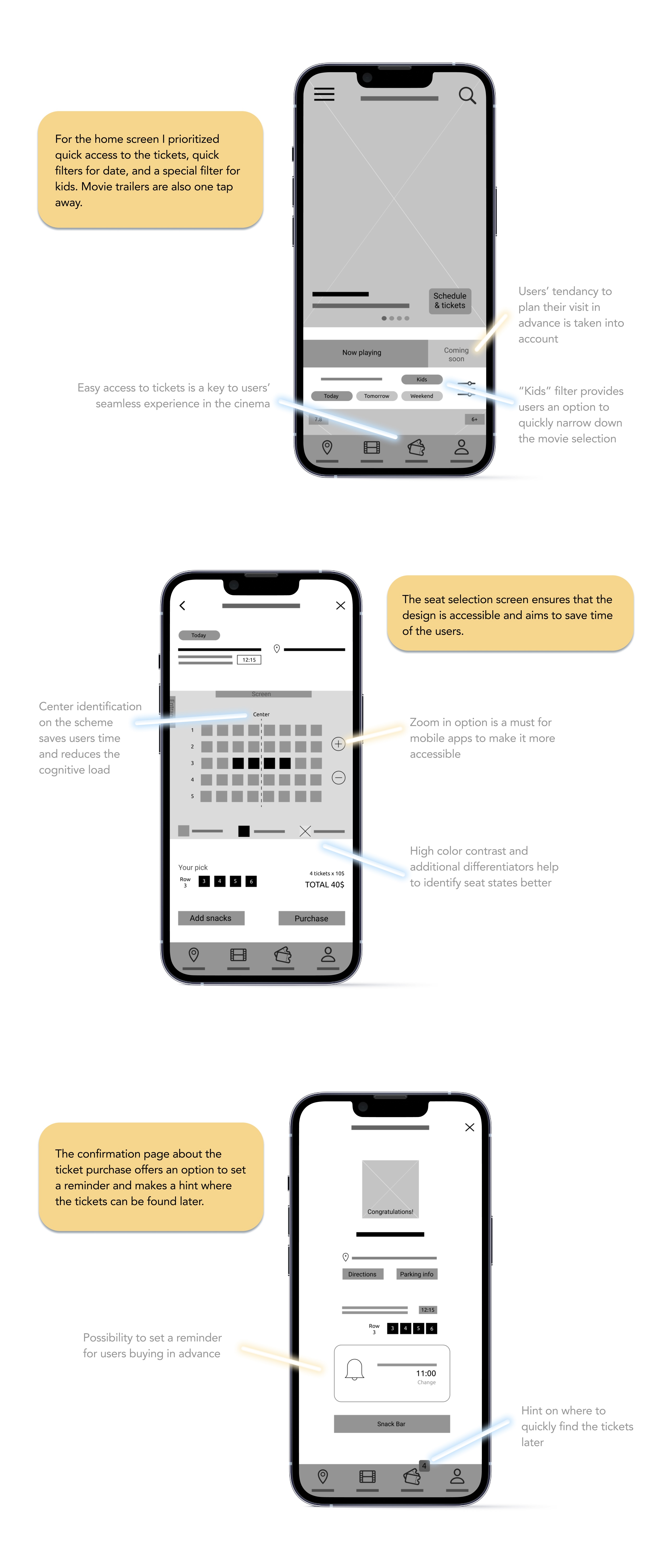
The next step was to create digital wireframes for the key screens of my product in Figma.
During the process I applied such Gestalt principles as similarity, proximity and common region.
Before moving into mockups, I explored color schemes, composition, imagery, and typography to establish a strong visual foundation.
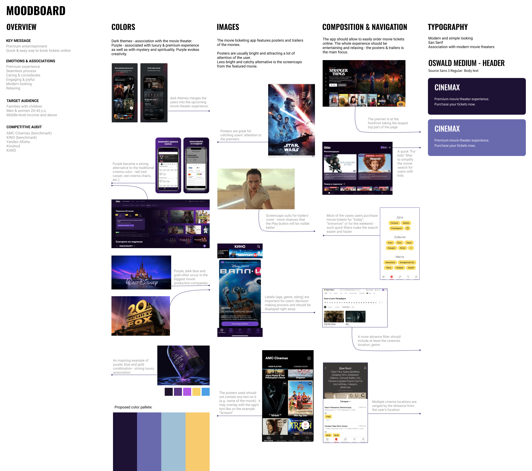
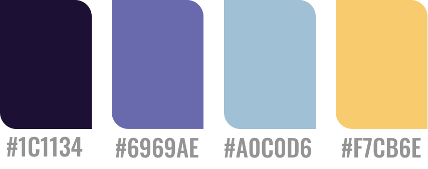
The moodboard informed my final color palette. Dark tones evoke the movie-watching experience and immerse users in the theater atmosphere. Purple conveys luxury and premium experience, offering a fresh alternative to the traditional cinema red. Blue and light purple work as secondary colors for the UI, while yellow serves as the primary accent.
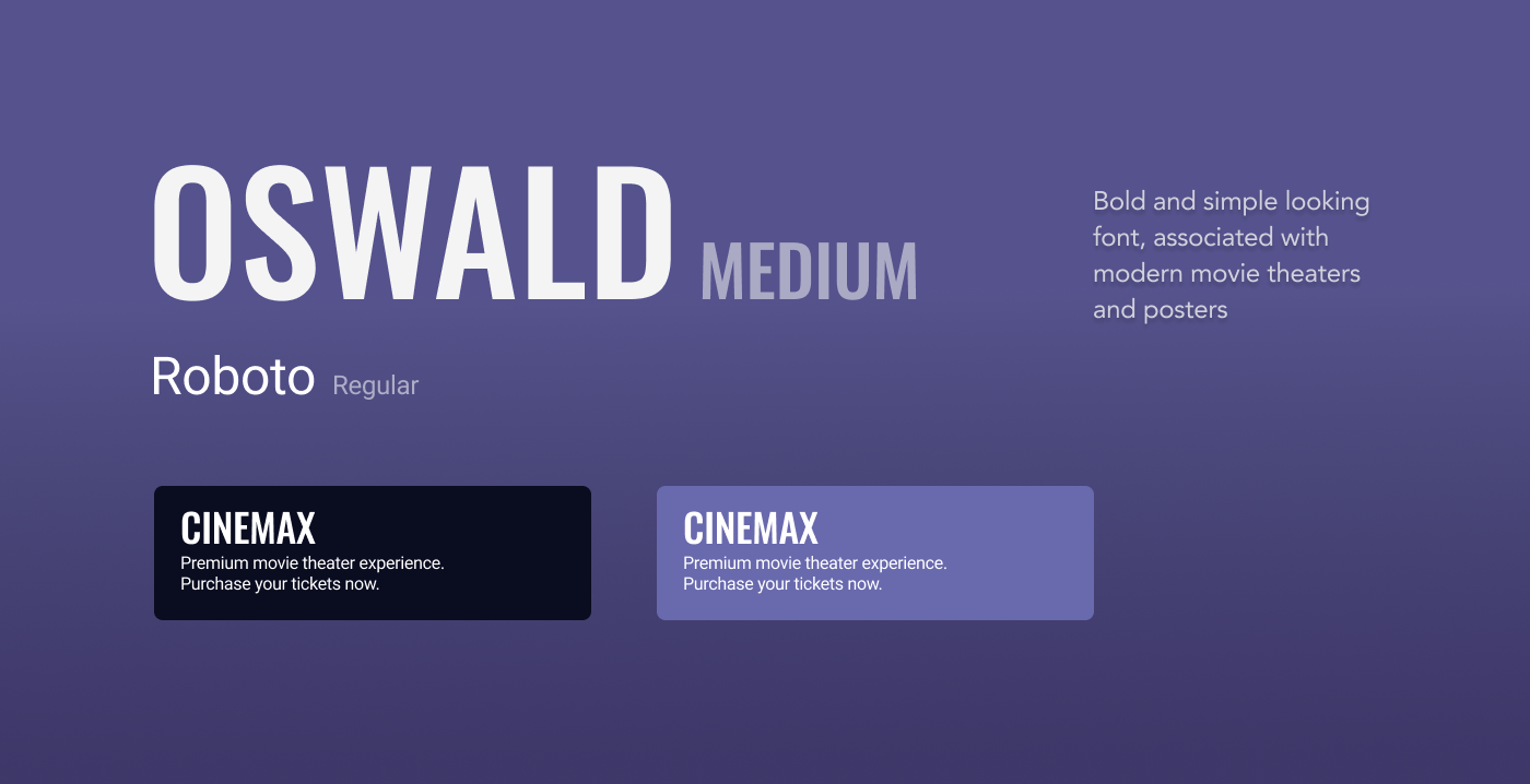
I selected Oswald Medium for headers and Roboto Regular for body text. Oswald’s bold, geometric style echoes contemporary movie theater branding and poster design. Roboto’s clean, universal forms provide contrast and balance, creating a contemporary yet approachable feel that complements the premium visual direction.
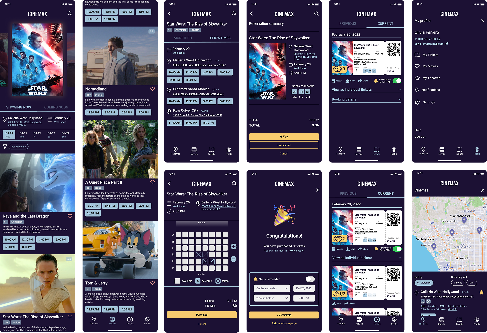
The final mockups below represent multiple design iterations refined through usability testing and user feedback.
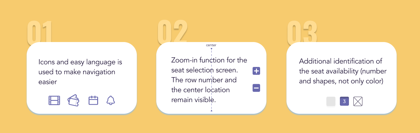
Accessibility emerged as a critical gap in competitive apps. Below are three key accessibility considerations I integrated into the design.
I conducted two rounds of usability studies. The low-fidelity prototype was used for the first round, the high-fidelity for the second one. Findings from the first round helped me understand users’ expectations from the app better and move more confidently to mockups. The second study used a high-fidelity prototype and revealed improvement opportunities.
I organized the second study findings in a Miro affinity diagram to identify patterns and prioritize improvements.
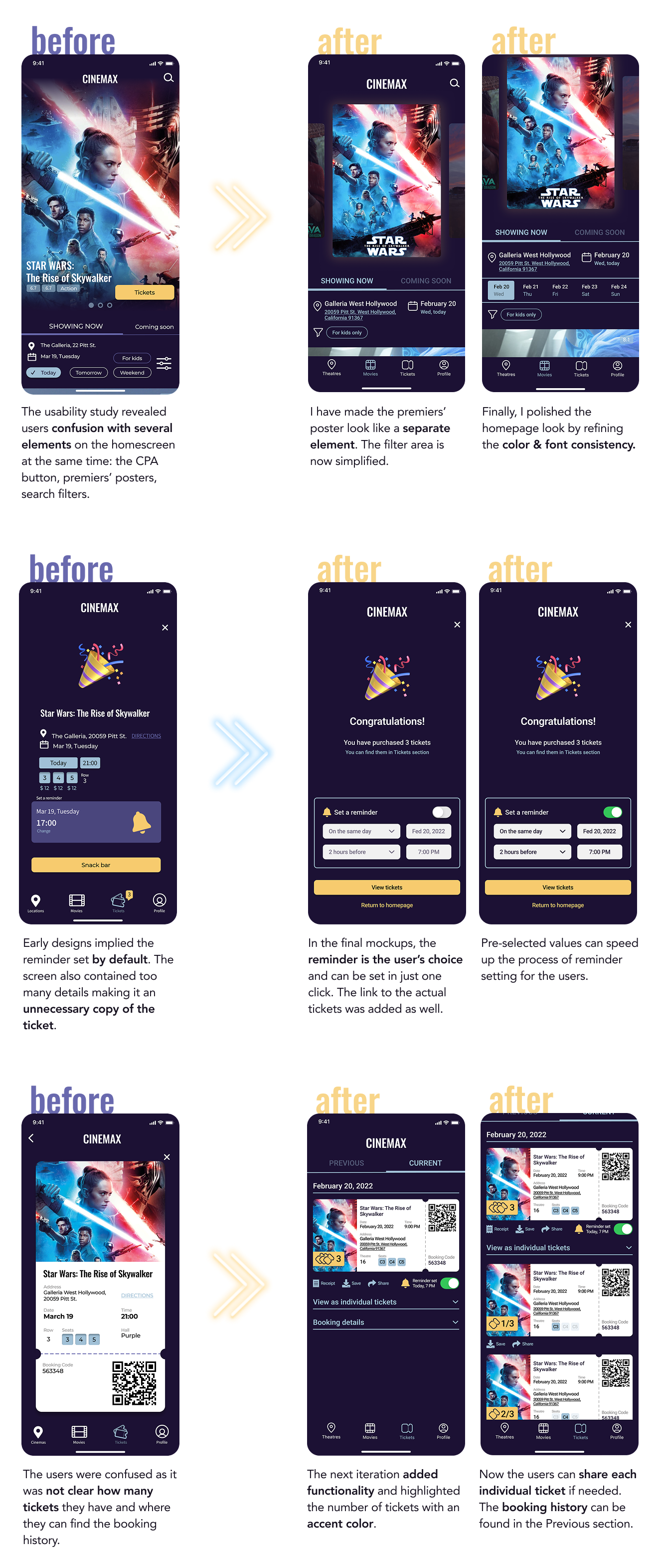
Even as a concept, the hi-fi prototype was tested with real users. The feedback validated the core design direction and revealed clear opportunities for future development.
"I loved it — I would definitely use the reminder function and the feature to save the movies I want to see in the future."
"I like the notification section and the design overall. It’s pretty intuitive."